Type and Media final project Shequalin [ʃɛ-'kwa-lin] is a text typeface designed for sophisticated humoristic literature and all kinds of typographic shenanigans. Be it satirical or dadaistic poetry, escapist or fictive novels, d’playful Shequalin seamlessly suits works by masters of the comical word. For the reader’s alertness, it rhythmically drops in oddities without distracting from the reading flow.
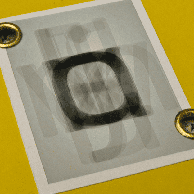
In order to create a more severe and fervent contrast, the roman and italic were designed independently and merged later, creating a dynamic sense of tension and blatancy in Shequalin. Subtlety can sweetly go to sleep!
Four weights each in roman and italic with lots of symbols and vignettes for typographical and visual communicating fun. Shequalin was my final project, the master thesis for TypeMedia at the KABK (Den Haag, NL). Also check out the website with a brief process: